In the modern, data-driven business environment, companies collect an overwhelming amount of information every single day. From customer interactions and complex sales pipelines to intricate inventory counts and daily financial transactions, Enterprise Resource Planning (ERP) systems like Odoo act as the central nervous system for organizational data. However, accumulating massive volumes of data is only the first step in the journey toward operational excellence. The real challenge that executives and department managers face is extracting meaningful, actionable insights from that raw information. Without a proper mechanism to interpret this data, companies often find themselves "data rich but information poor," struggling to make confident, strategic decisions. To bridge this critical gap, businesses must elevate their standard practices by integrating dynamic, visual Odoo reporting that transforms complex, overwhelming datasets into clear, easy-to-understand narratives that drive immediate action and foster sustainable growth.
Historically, extracting insights from an ERP system was a heavily manual, tedious, and time-consuming process. Traditional methods often required users to navigate through complicated menus, generate static lists, and export massive files into third-party spreadsheet software. From there, analysts would spend hours—sometimes days—building pivot tables, formatting charts, and compiling presentations for the executive board. By the time these static reports were reviewed, the data was already outdated, rendering it virtually useless for real-time decision-making in a fast-paced market. This reactive approach is a significant bottleneck for modern enterprises that need to pivot rapidly in response to changing consumer demands or supply chain disruptions. Leaders cannot afford to wait until the end of the month to know if they are hitting their targets; they need instantaneous access to their company's vital signs.
The science of cognitive processing heavily supports the transition from text-heavy spreadsheets to highly visual dashboards. The human brain is naturally hardwired to process visual imagery significantly faster and more efficiently than rows of raw numbers. When a manager stares at a massive table detailing thousands of daily transactions, it requires immense cognitive effort to identify trends, spot outliers, or determine the overall health of a department. Conversely, when that exact same data is mapped onto a colorful bar chart, a dynamic line graph, or a clear gauge metric, the underlying story becomes instantly recognizable. A well-designed visual interface dramatically reduces cognitive load, allowing decision-makers to bypass the mental fatigue of data crunching and focus entirely on strategic execution and high-level problem-solving.
Implementing a unified, visual approach to data management has a profound impact across every single department within an organization. Consider a high-performing sales team. For these professionals, momentum and timing are absolutely everything. A customized dashboard allows sales directors to monitor lead conversion rates, track the real-time value of the sales pipeline, evaluate individual representative performance, and analyze geographical revenue distribution at a passing glance. Meanwhile, the supply chain and inventory management teams require a completely different set of vital metrics. They need visual alerts highlighting dangerously low stock levels, identifying slow-moving inventory that is needlessly tying up capital, and tracking unpredictable supplier delivery times. By providing each department with tailored, real-time visual insights, a company effectively breaks down isolated operational silos, fostering a culture of absolute transparency and seamless cross-functional collaboration.
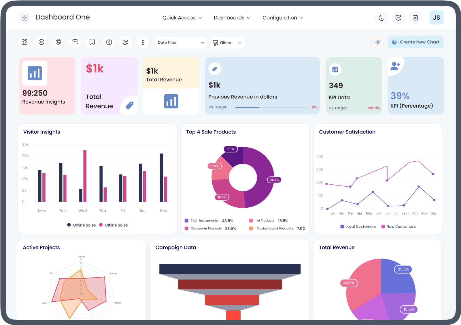
Furthermore, the true transformative power of an advanced dashboard lies in its deep customization and exceptional agility. Because no two businesses operate in exactly the same way, generic, out-of-the-box templates often fail to capture the unique nuances of a specific industry or a specialized workflow. Companies require a highly flexible solution that allows them to mold their analytical environment to fit their highly specific key performance indicators (KPIs). The ability to intuitively drag and drop visual widgets, apply dynamic filters on the fly, and drill down from a high-level summary chart straight into the granular transactional data separates basic reporting from true business intelligence. This level of flexibility ensures that as a company scales, enters new geographical markets, or completely shifts its strategic focus, its analytical tools can seamlessly adapt and scale right alongside it.
Transitioning from a reactive operational model to a proactive one is the ultimate goal of implementing advanced data visualization. When leadership has immediate, real-time access to visual trends, they stop reacting to business crises after they have already caused financial damage and begin anticipating them before they even occur. If a normally highly profitable product line suddenly shows a sharp, unexplained dip in margins, a dynamic line chart will immediately highlight that downward trajectory. This allows management to investigate pricing strategies or unexpected supply chain costs immediately, rather than waiting for a quarterly financial review. Similarly, if marketing expenditures increase without a corresponding spike in customer acquisition, visual tools flag this discrepancy instantly. It is this proactive, forward-looking capability that empowers businesses to maintain a sharp competitive edge.
Ultimately, unlocking the full potential of your Odoo ERP investment requires equipping your workforce with the absolute best analytical and visualization tools available on the market. Simply storing your operational data securely in a database is no longer sufficient to stay ahead of the competition; you must be able to interact with it, question it, and let it visually guide your most critical strategic initiatives. Taking absolute control of your business intelligence means investing in solutions that prioritize user experience, comprehensive data integration, and crystal-clear visual clarity. To truly revolutionize how your entire organization interacts with its daily metrics and to explore the specific technical capabilities that can make this a reality, it is highly recommended to explore comprehensive Odoo BI features. By empowering your team with customized, real-time visual insights, you are laying the crucial groundwork for supreme operational efficiency, rapid scalability, and long-term business success.




Share this page with your family and friends.